Bottom Navigation Bar With Compose
Published May 15, 2020
The Twitter app uses a navigation drawer for some navigation destinations but it also uses a bottom bar for the most often used screens: home, search, notifications, and messages. This post adds the bottom bar component to my sample app and also shows how the docked floating action button positions work with the bottom bar.
Create the bottom bar component
The bottom bar hosts several IconButton components to display the navigation options and handle the click events. Check out one of my previous posts if you want to learn more about the IconButton. The first step is adding icon resources for these buttons. I use vector resources for each destination. In the asset studio the home, search, notifications, and mail clip art work for this example.
Once the icons are ready the composable function for the bottom bar is added. Four listeners are passed as parameters. These are hooked up to the IconButton components to handle the click events.
The content parameter for the BottomAppBar uses a RowScope. This means I can use Modifier.weight() to ensure that each IconButton takes up the same width in the row.
Add bottom bar to Scaffold
Once the initial component is setup, it is added to the Scaffold component to display it.
Once the Scaffold knows about the bottom bar it is shown on the screen with the other contents.
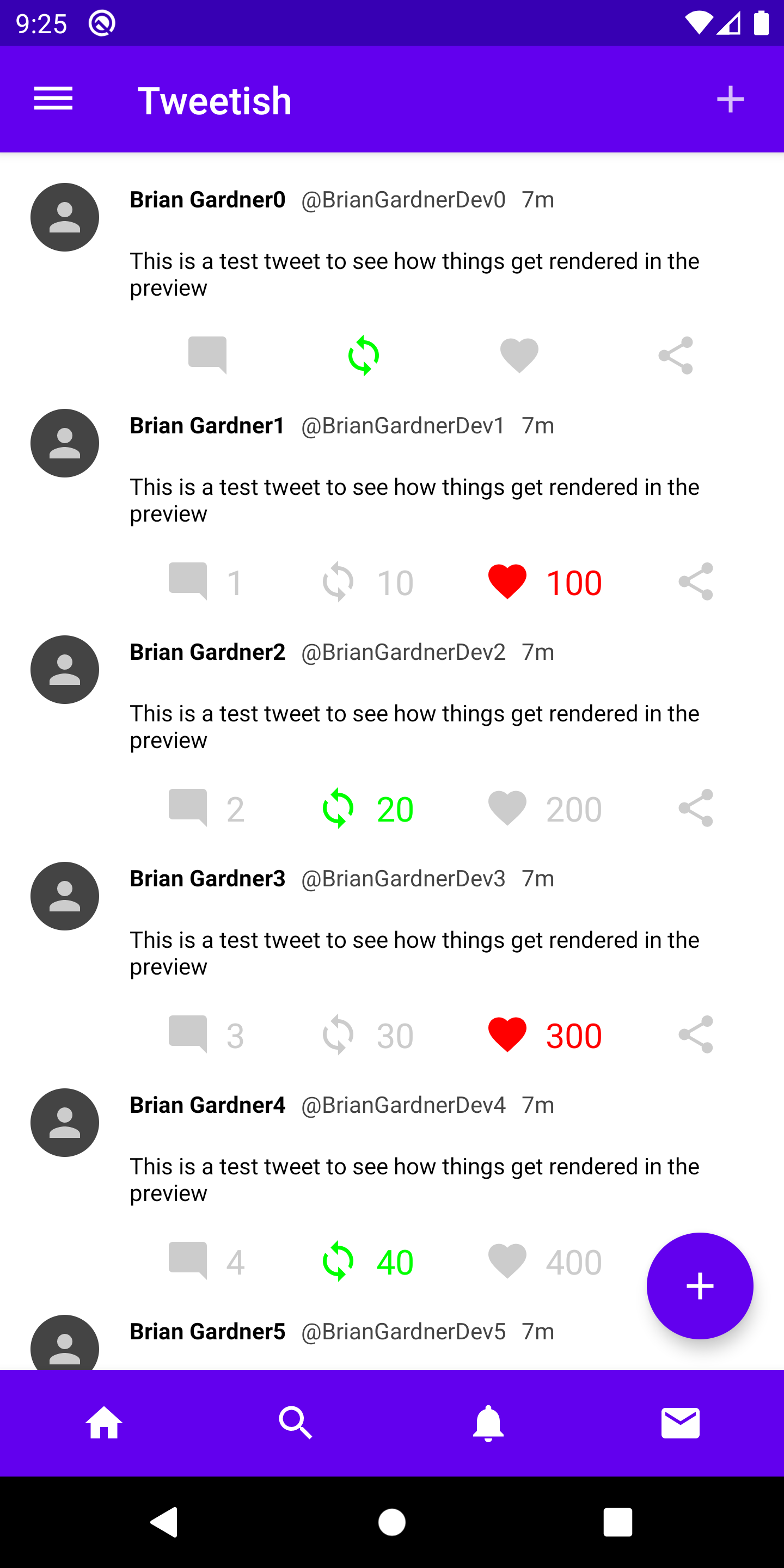
The color of the bar is set automatically using the primary color of the app theme. The color of the icons are also set from the theme. In a future post I will show how to create a custom theme with Compose.
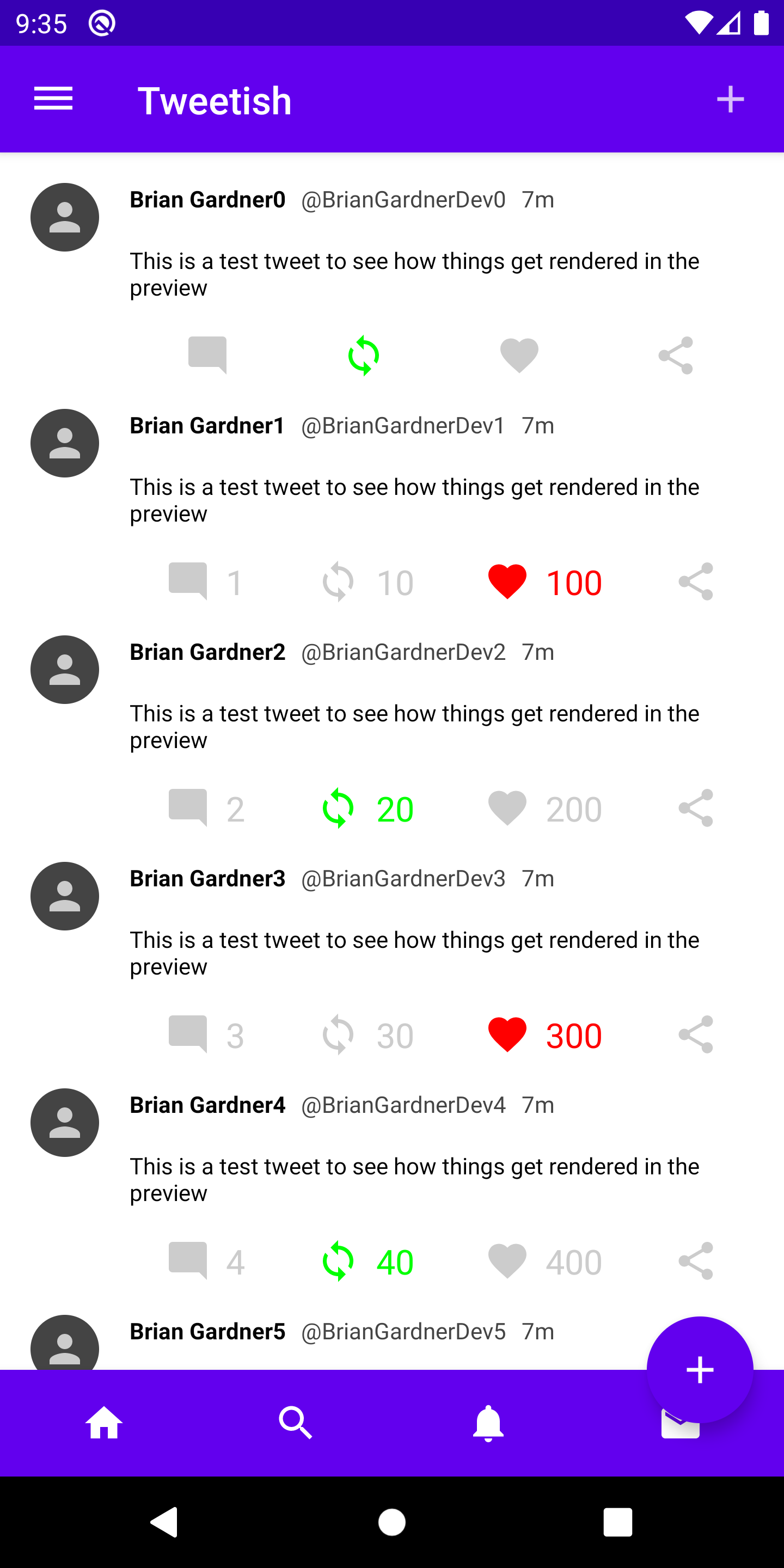
FAB docked positions
Another thing to notice is that the floating action button moved up so it is not overlapping with the bottom app bar. This helpful positioning comes from the Scaffold arranging the components on the screen.
In my floating action button post I covered the End and Center positions for the button. There are two other positions that work with the bottom app bar by docking the button within the bar. The button will overlap with the bar and the bar will have a cutout to make room.
Implementing this requires a couple steps. First, the position of the floating action button is set in the Scaffold using the floatingActionButtonPosition property. In this example I use EndDocked but you can also use CenterDocked if you want the button in the middle.
Running the app shows the floating action button overlapping with the bottom app bar.
The reason for this is that the bottom app bar does not yet know anything about the floating action button position. The Scaffold positions the button but the bottom bar needs to know where it is in order to layout itself.
There is a property on the BottomAppBar called FabConfiguration that handles this. When the bottom bar is setup in the Scaffold, the lambda provided accepts a FabConfiguration parameter that can be passed to the BottomAppBar. First, the TweetBottomBar is updated to accept a FabConfiguration parameter and pass it to the BottomAppBar constructor. The cutout shape is also provided so the bottom bar knows what shape the button is.
Then the FabConfiguration is passed to the TweetBottomBar from within the Scaffold.
Running the app now shows another issue.
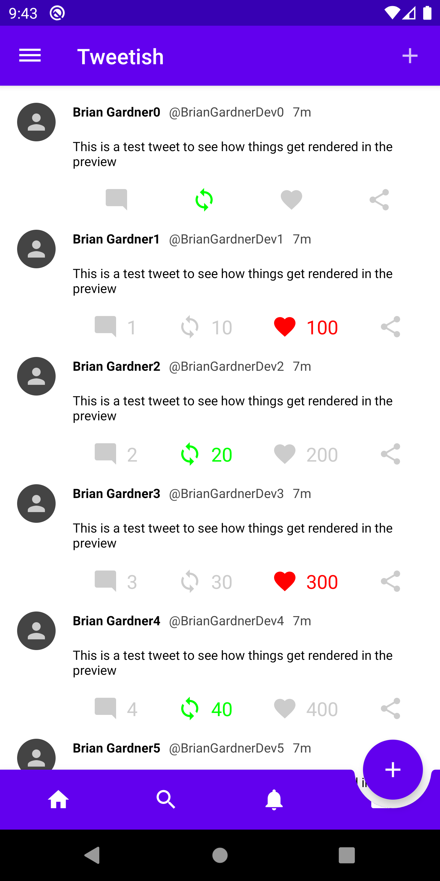
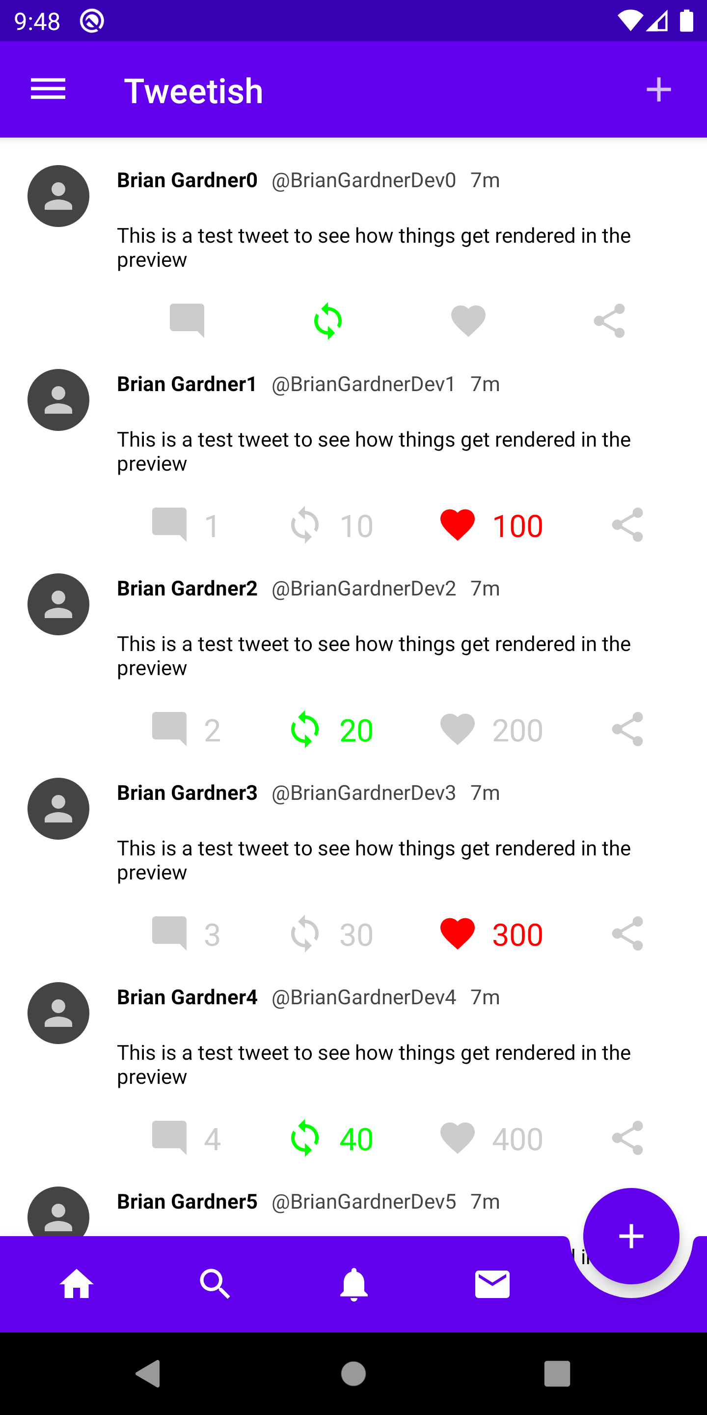
The floating action button is positioned correctly and the bottom app bar has a cutout, but the messages icon is being cut off. In order to avoid this, an empty Box can be added to the BottomAppBar content to ensure the icons are not clipped by the button.
Once this spacer is in place the icons are pushed away from the floating action button.
With that, the bottom app bar is complete. It provides a simple means to add navigation icons in easy reach for your users. Simplifying the floating action button cutout is a nice bonus as well.
Thanks for reading and stay tuned for more!
Photo by Andrew Neel on Unsplash.