Floating Action Button With Compose
Published May 08, 2020
This post takes a look at adding a Floating Action Button to replace the add action in the TopAppBar. Since that is the main action on the screen it makes sense to put it into the floating action button to position it in an easier to tap location.
Create the button
The first step is to create a new composable function for the button. This function will be included in the Scaffold when it is ready.
The next step is to create the button with the FloatingActionButton function. There are two versions of this in FloatingActionButton.kt. One version takes in some text to display and a listener. The second version takes in a listener and requires a composable function to be passed in to create the child views for the button.
The second version is used since it only requires an Icon.
Next, the FloatingActionButton is created with an Icon child. The onClick lambda is left empty for now just to get things working.
Add button to the scaffold
The Scaffold has a parameter for the floating action button that will ensure that it is positioned correctly.
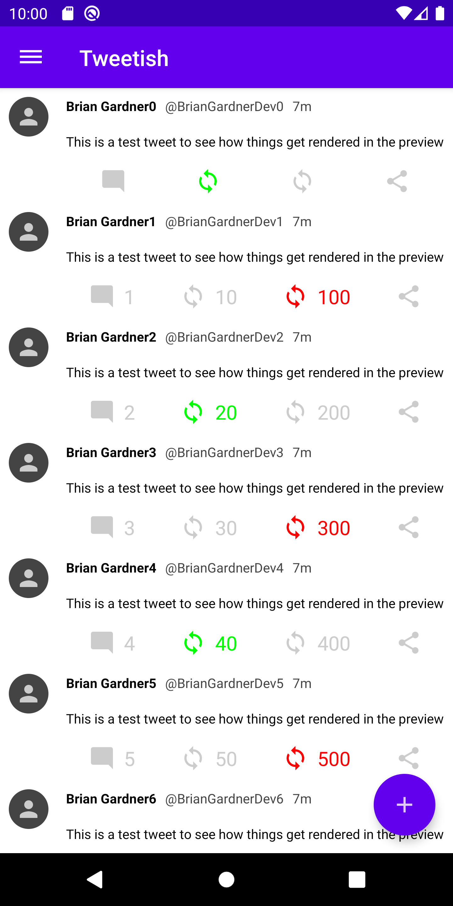
Running the app after adding the button to the scaffold shows it in the bottom right corner.
Reacting to clicks
Handling click events involves adding the handling code in the onClick parameter on the FloatingActionButton. In this case, a Toast will do well enough to prove the point.
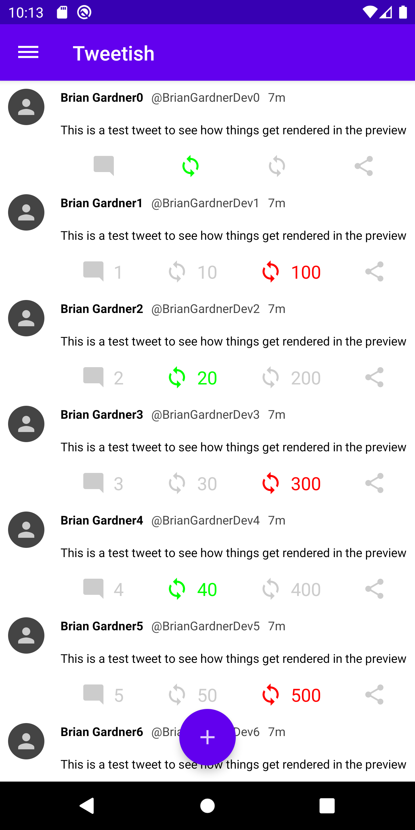
Running the app shows that the Toast is displayed when the button is clicked. The button also has a nice ripple animation by default which is nice feedback for the user.
Position the button
Another option provided by the Scaffold is changing the position of the button. The floatingActionButtonPosition parameter handles this functionality. The default value is Scaffold.FabPosition.End which positions the button at the bottom end of the screen. Another option is Scaffold.FabPosition.Center which places the button at the bottom of the screen in the center. Using this may look good depending on the design of the app.
There are two additional options: Scaffold.FabPosition.EndDocked and Scaffold.FabPosition.CenterDocked. These are to be used with the BottomAppBar component, and the Scaffold will actually throw an exception if it is not used.
Overall, adding the FloatingActionButton is fairly streamlined with the use of the Scaffold. My next post will look at using the BottomAppBar and how the docked position of the floating action button compare.
Thanks for reading and stay tuned for more!
Photo by Wim van ‘t Einde on Unsplash.