Container Deprecation and Icon Buttons
Published March 25, 2020
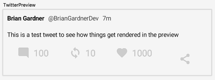
This post aims at fixing an impending issue with my current Tweet view implementation. In the dev08 release of Compose the Container component is going to be removed. I have several usages of this component which I want to remove before updating my version.
Better icon drawing
The current usages of Container facilitate drawing vector assets for the action row items. While I could replace these instances with a Box component (the simple replacement for Container), there is a more suitable component available.
I can instead use the Icon component. This component has three parameters. The first is a VectorAsset which can be provided by the vectorResource() function. The other two parameters are optional. A modifier and tint can be provided to configure how the icon is drawn to the screen.
A regular Icon can be used for the Comment, Like, and Retweet items.
All of the parameters needed by the Container can be directly passed to the Icon. The LayoutSize modifier allows me to specify how large the icons need to be. The tint parameter allows me to handle coloring the icon without using the drawVector() function.
This implementation is only used for the Comment, Like, and Retweet items because they still need to be wrapped in the Clickable function. This is because both the Icon and Text should react to the click event.
The Share function can use a different component. It still needs the Icon to draw the share vector to the screen, but it can be wrapped in an IconButton to handle the click event instead.
The IconButton wraps the Icon and has a parameter that accepts the onClick listener. Running the app now reveals an issue.
The share icon is now taking up more space than the other icons, even though I specified the size of the Icon to be 24.dp. The reason for this is found inspecting the source for IconButton.
The IconButton is implemented using a Box. It has a default modifier applied called IconButtonSizeModifier which is defined as:
Since I do not set the size of my IconButton it defaults to 48.dp. To fix this I need to explicitly specify the size of the button.
This forces the share icon to be the correct size.
Add ripple animation
One other change becomes apparent when interacting with the Share button. The IconButton provides a ripple animation out of the box.
It would be nice for the other action row items to have a ripple as well. Adding this animation involves wrapping the Clickable function with a Ripple. This function provides a ripple animation when tapped. The bound parameter indicates if the animation should be constrained to the bounds of the view or if it should be allowed to extend beyond.
Providing false for the bound property causes the animation to go outside the size of the button.
By default, the ripple size is based on the size of the Ripple contents. The radius property can be provided to force a certain size but this runs the risk of the ripple being smaller than the content, which would look odd.
Providing true for the bound property forces the ripple to stay within the view bounds.
This may work better for buttons since the animation will not bleed over into the other content. However, in this case I will leave the ripples unbounded so they match the share ripple. The current IconButton implementation does not allow modifications to the Ripple animation. I would rather have the animations be consistent in shape, even if their sizes are different.
With that, all of the deprecated Containers have been removed from my project and drawing the icons has been improved. As a bonus, the action row items now have a nice ripple animation to give the user some visual feedback.
Thanks for reading and stay tuned for more!
Photo by Stefany Andrade on Unsplash
Photo by Namroud Gorguis on Unsplash.