App Theme With Compose
Published May 22, 2020
Customizing the theme of an app makes it stand out for users. While the default MaterialTheme is a good start, I wanted to modify it to make my sample app look better.
Compose provides a new way to create the theme for its components. I still needed to modify one thing in my styles.xml but most of the work is done with Compose.
Custom theme
Currently, my sample app uses the default MaterialTheme to provide the styling for my components.
A custom theme component is required if I want to modify its properties. Creating one is similar to other composable components. A function annotated with @Composable lays the foundation. This function accepts one parameter representing the composable content that the theme is applied to.
To get things initially working I call the MaterialTheme within the custom theme. The content parameter is passed in so the theme is applied. This has the same behavior as using the MaterialTheme directly in my onCreate function in MainActivity.
Once this initial theme is setup it is called from the MainActivity to wrap the screen contents.
Running the app at this point shows the same look and feel as before, since it is still using the vanilla MaterialTheme. At this point, I can start to modify it to customize how my app looks. The main modification will be to the colors of the app.
Theme colors
The MaterialTheme constructor accepts a ColorPalette object that specifies the major colors for the app. This includes colors for the various surfaces of the app, as well as the colors for the content rendered on those surfaces such as text.
Using the Material Color Tool I came up with a simple color scheme I liked. Since this is a light theme I use the lightColorPalette function to construct my ColorPalette object.
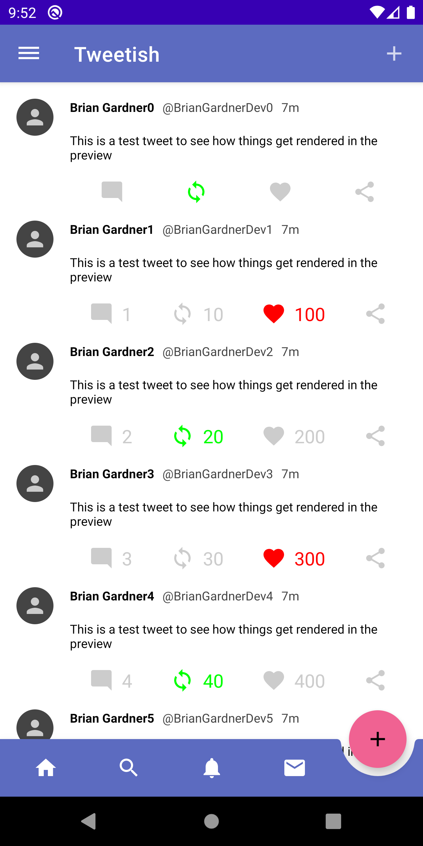
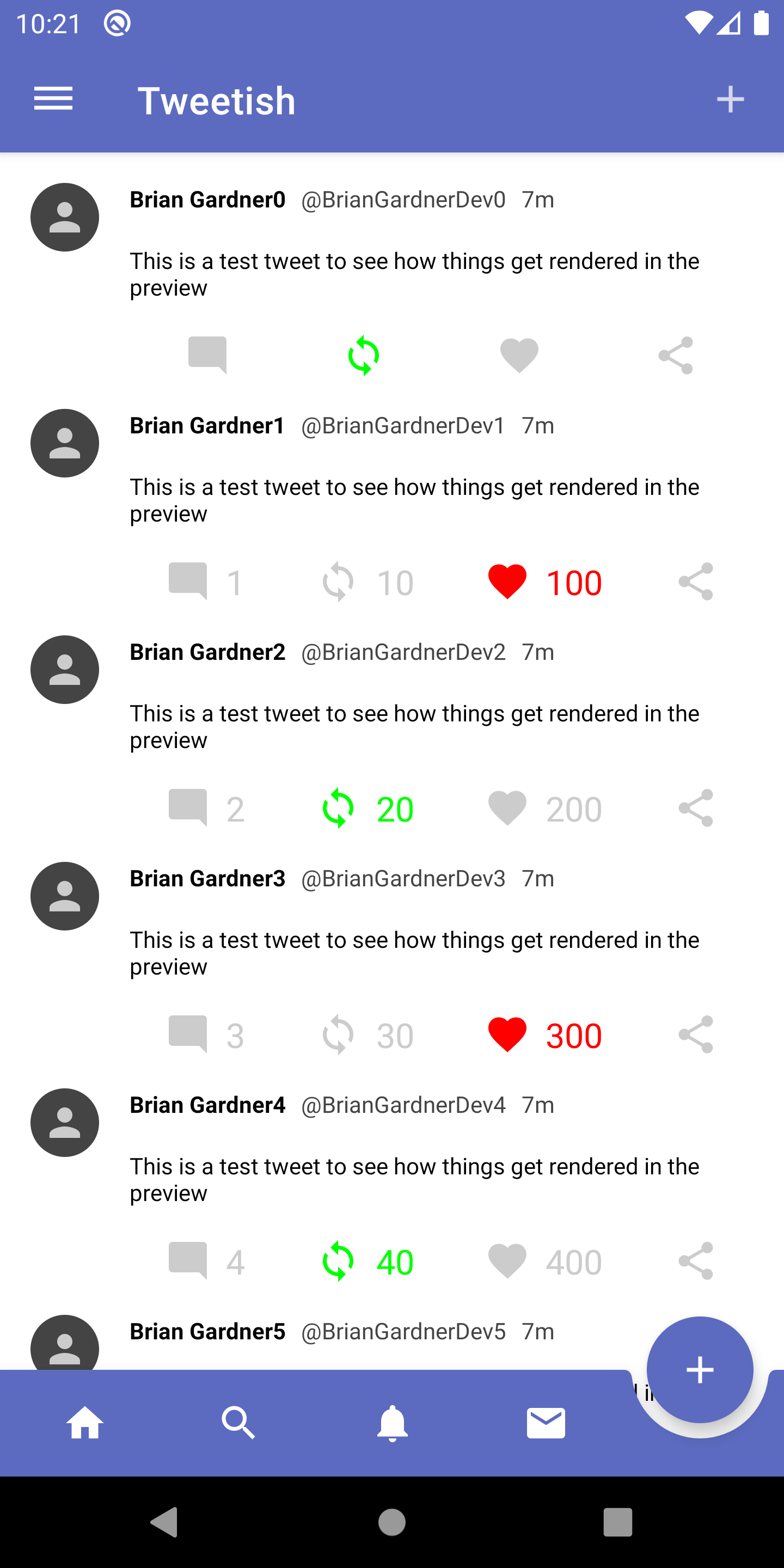
These colors are passed in to the colors parameter of the MaterialTheme constructor. Running the app at this point renders these colors and surfaces an issue.

While the toolbar and floating action button have the color applied, the status bar at the top is still using the default dark purple color. The reason for this is that the status bar is not a composable element contained within the new TweetTheme so its style is applied from the usual styles.xml file.
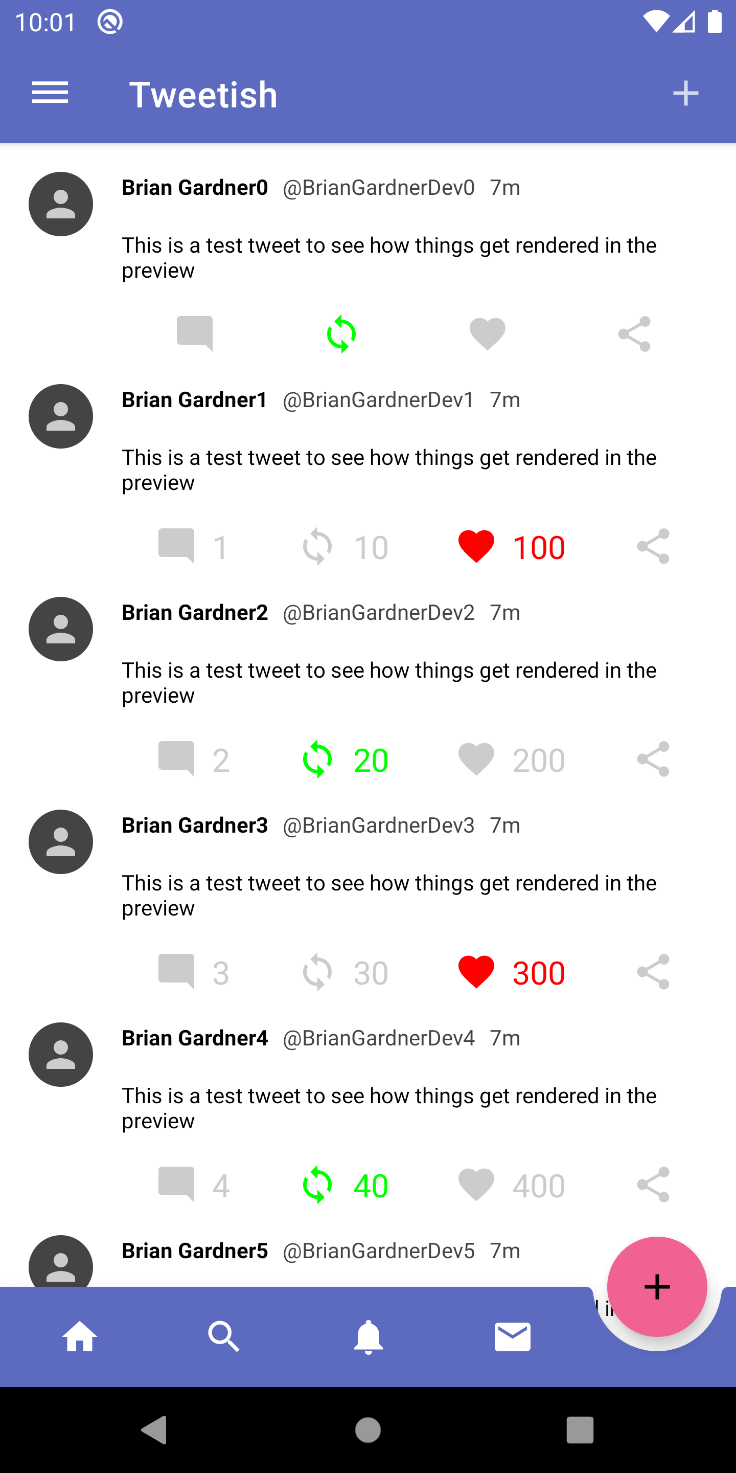
In order to modify these values, I need to update the colorPrimaryDark in my colors.xml. I’ll go ahead and update the colorPrimary and colorAccent while I’m there to make sure these values align with those in my TweetTheme.
I define the same color for the primary and dark variant since I like the way it looks. Running the app shows the colors correctly applied to the status bar.

In order to access these colors in the composable functions, there is a MaterialTheme object that is used. The colors property exposes the ColorPalette, from which any of the theme colors are accessed. A handy function is the contentColorFor() which accepts a color as a parameter and returns the associated content color that should be used.
Setting the background color and content color of my floating action button ensures that the surface color is correct and that the text displayed on top is legible.

Theme typography
Another configurable option in the theme is the typography. This is not something I ended up doing for my sample app but it is an option depending how you like to declare your themes.
Declaring your text styles involves declaring a Typography object. This object has various properties for header, subtitles, body, and button styles.
To me, this style declaration seems web-based. It would take me some time to get used to declaring my styles like this and use them in an app. The inability to declare custom text styles in the Typography set is also disappointing but I am hoping that will be an option in the future.
Overall, themeing the app is relatively straightforward. I am looking forward to new options for a standardized text theme in my sample app but I will continue to experiment with the existing Typography option.
How are you specifying the text styles in your composable apps? I would love to hear how other folks are handling their text styles.
Thanks for reading!
Photo by Steve Johnson on Unsplash