Navigation Drawer and Composable Scaffold
Published May 01, 2020
Navigation is an important feature in any Android app. One of the common ways to display navigation is through the navigation drawer. This post adds the navigation drawer to the Tweetish app through the use of the Scaffold component.
Other options
If you look through the compose documentation you will likely find the ModalDrawerLayout which implements the typical navigation drawer. This is the first component I tried using to add the drawer but it did not work as I expected.
Adding the component to the app involved specifying the state of the drawer, passing a state change listener, setting the drawer content, and setting the body content. I initially set the drawer content to be empty just to verify everything worked. Running the app and opening the drawer showed the first issue.
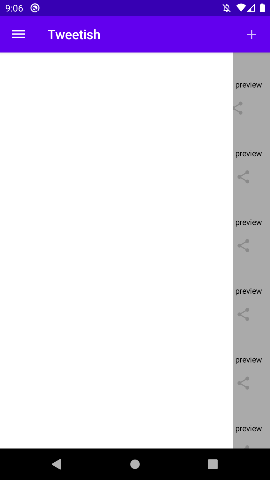
The navigation drawer is drawn below the app bar. This is contrary to the Material Design specifications for the modal drawer that recommends it be drawn on top of the app bar.
Testing out the gestures also resulted in another unexpected issue.
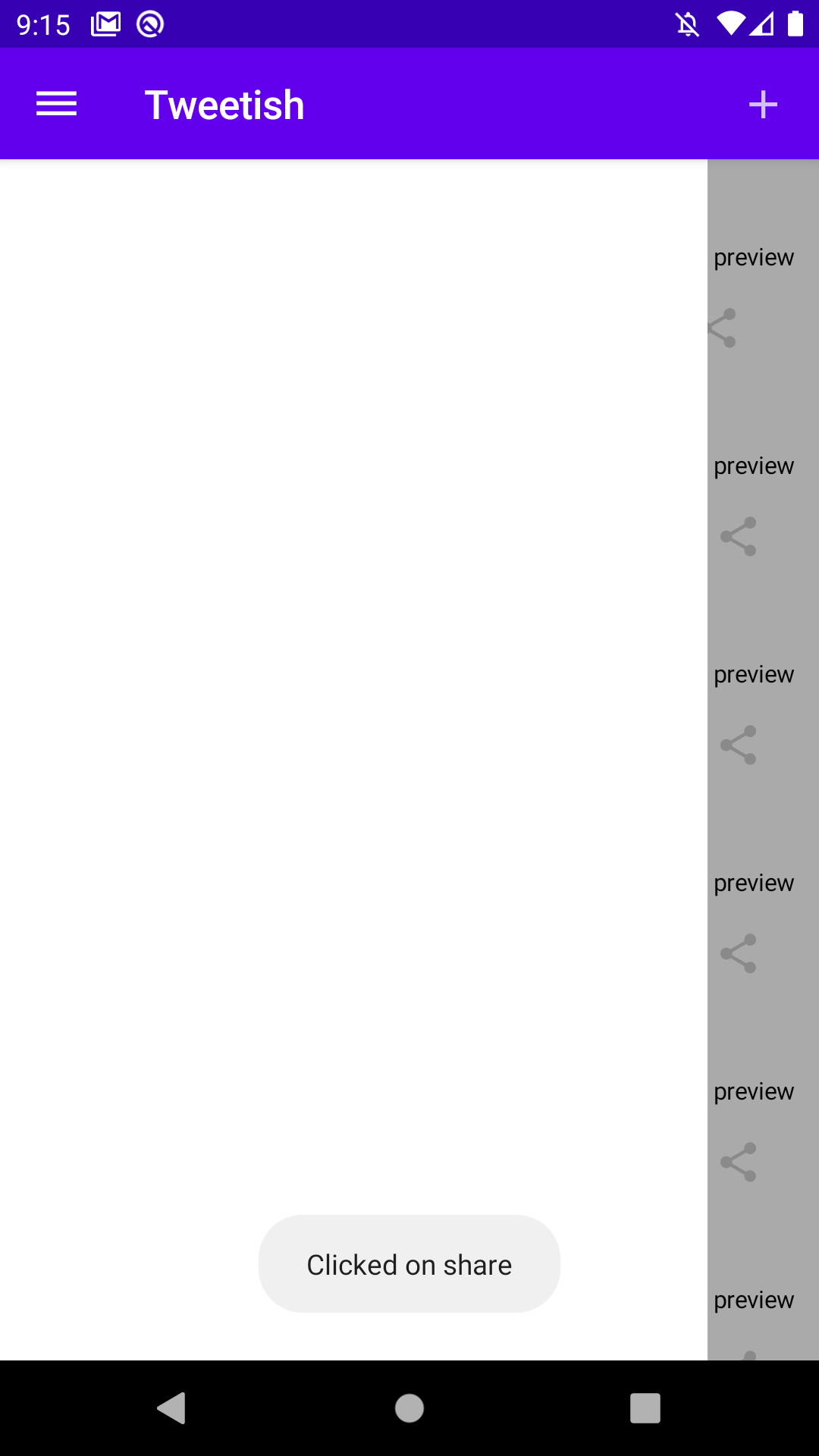
I was able to click on the share buttons in the main screen content behind the drawer. This is another issue since the content behind the drawer should not react to any click events when the drawer is open.
Still, I persisted adding the content to the drawer. Running the app gave me the third strike.
The navigation drawer is not just drawn below the app bar, it is actually drawn behind it. This causes the navigation content to be drawn below the app bar which is not very useful. I looked into adding elevation to the ModalDrawerLayout but it does not accept a modifier parameter to change the elevation.
These issues required a change in strategy.
Better option
I turned to the Compose channel on the Kotlin slack workspace. Zach Klipp recommended a better component that should suit my needs.
You probably want to use Scaffold. It will make sure your app bars, drawers, FABs, and content are laid out correctly Not sure about the touch-through issue though.
Checking out the Scaffold component looked promising. The function accepts all the parameters I would need for my app bar, drawer content, body content, and it even has parameters for the floating action button covered in my next post.
Creating the Scaffold is straightforward since all of my components are broken out into small composable functions.
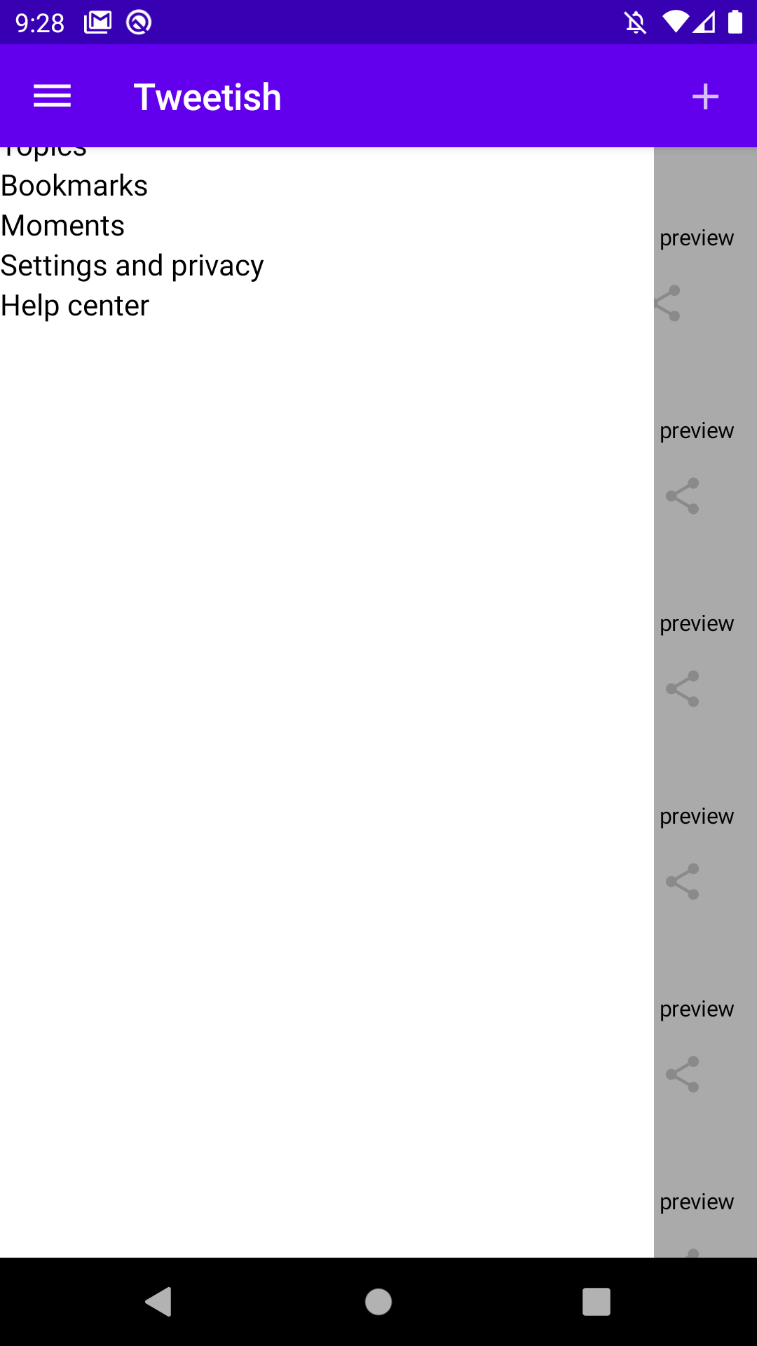
The TweetBar is passed to the topAppBar parameter and the TweetList is passed to the bodyContent. The drawerContent is left blank for now to verify everything works as expected. Running the app verifies that the drawer is now drawn above the app bar.
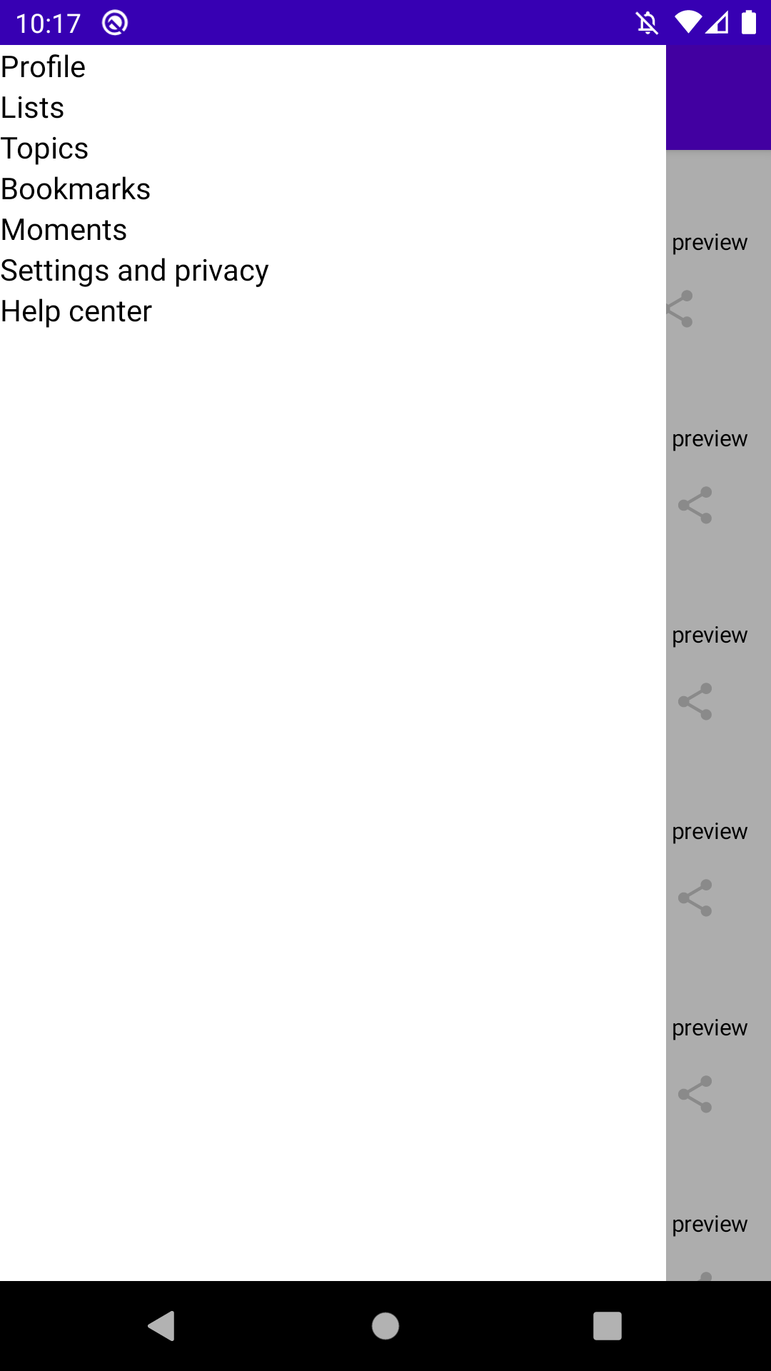
The next step is filling out the drawer content. Adding a new composable function is cleaner than implementing it within the drawerContent parameter.
For now it is just a column with various text items to match the Twitter app. I’m not going to focus on styling the components since it works the same as any other composable items.
Adding the TweetNavigation to the Scaffold involved putting it in the drawerContent lambda.
Running the app confirms that the drawer content is filled out.
The next step is to hook up the navigation icon button. The drawer should open when it is selected. This first involved setting up a ScaffoldState. This object specifies the current drawer state, either open or closed, as well as if the drawer state should change using gestures.
Wrapping the ScaffoldState creation in a state {} block provides access to the state itself as well as a change function that can be invoked to set the state. Once the state property is set it can be passed to the scaffoldState parameter on the Scaffold.
The onScaffoldStateChange function can then be used to change the state of the scaffold when the navigation icon is clicked.
First, the TweetBar needs to take in a click listener as a parameter to handle the navigation icon click.
Then, the ListScreen can pass in the listener that modifies the scaffoldState and calls the onScaffoldStateChange listener to the TweetBar component.
One last cleanup task involved updating the TweetBarPreview so the project will build. An empty lambda is enough to satisfy the compiler.
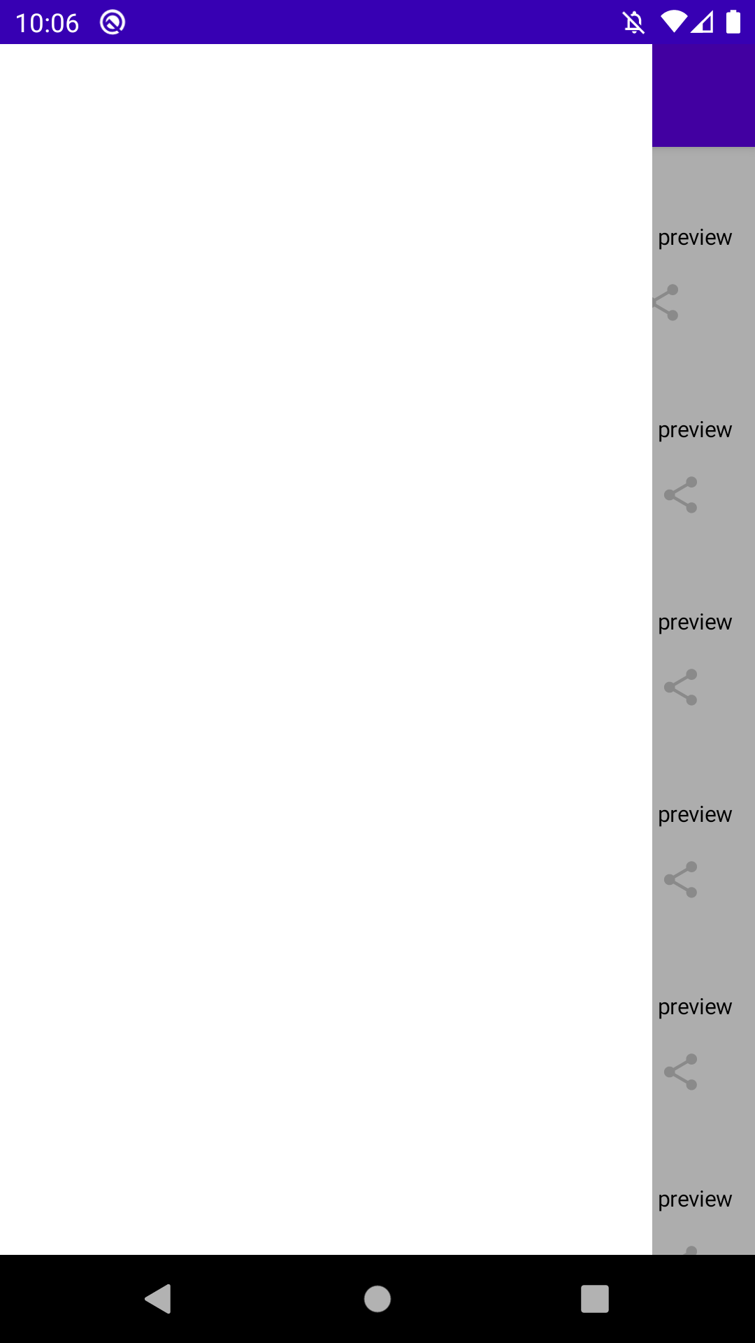
The listener queries the current state of the drawer and sets it to the opposite. Running the app shows that clicking on the navigation icon opens the drawer.
With that, the navigation drawer component is complete. A future post will examine how to perform the navigation when a navigation item is clicked. This will likely tie-in the navigation architecture component for even more Jetpack goodies.
Thanks for reading and stay tuned for more!
Photo by Samuel Ramos on Unsplash.