Composable App Bar
Published April 24, 2020
This post focuses on styling my copy-cat Tweet app with an App Bar. I will take a look at the component used to add the app bar as well as its various parameter options.
Create an app bar
Compose has a couple components available for top and bottom navigation bars. Implementing an app bar is the job of the TopAppBar component. This add the bar at the top of the screen and it has parameters for a title, navigation icon, and action icons.
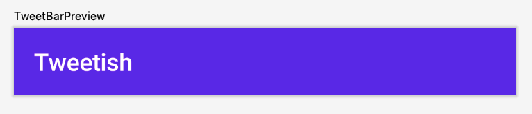
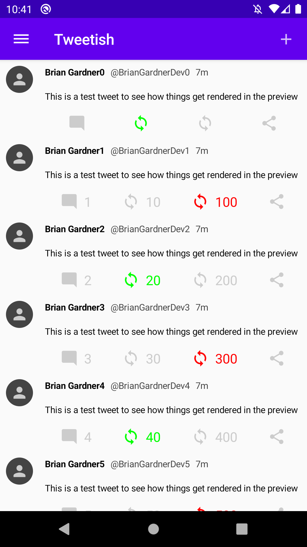
The first step is to add a new @Composable function representing the app bar for this screen. It will configure a TopAppBar with just a title for now. The title parameter accepts a composable lambda where I can provide a Text component to display.
Adding a preview function allows me to see how things look.
The app bar is automatically tinted with the theme’s primary color, but it can be changed using the color property. A future post will modify the theme of the app so I will leave it as-is at the moment.
Next, I want to display my new app bar on the screen. This requires a new composable function where the TweetList and TweetAppBar are combined. Since this new component will represent the entire screen, I call it ListScreen.
This component accepts the list MutableState so it can forward it to the TweetList. This component is then used inside the onCreate function to display it when the app runs.
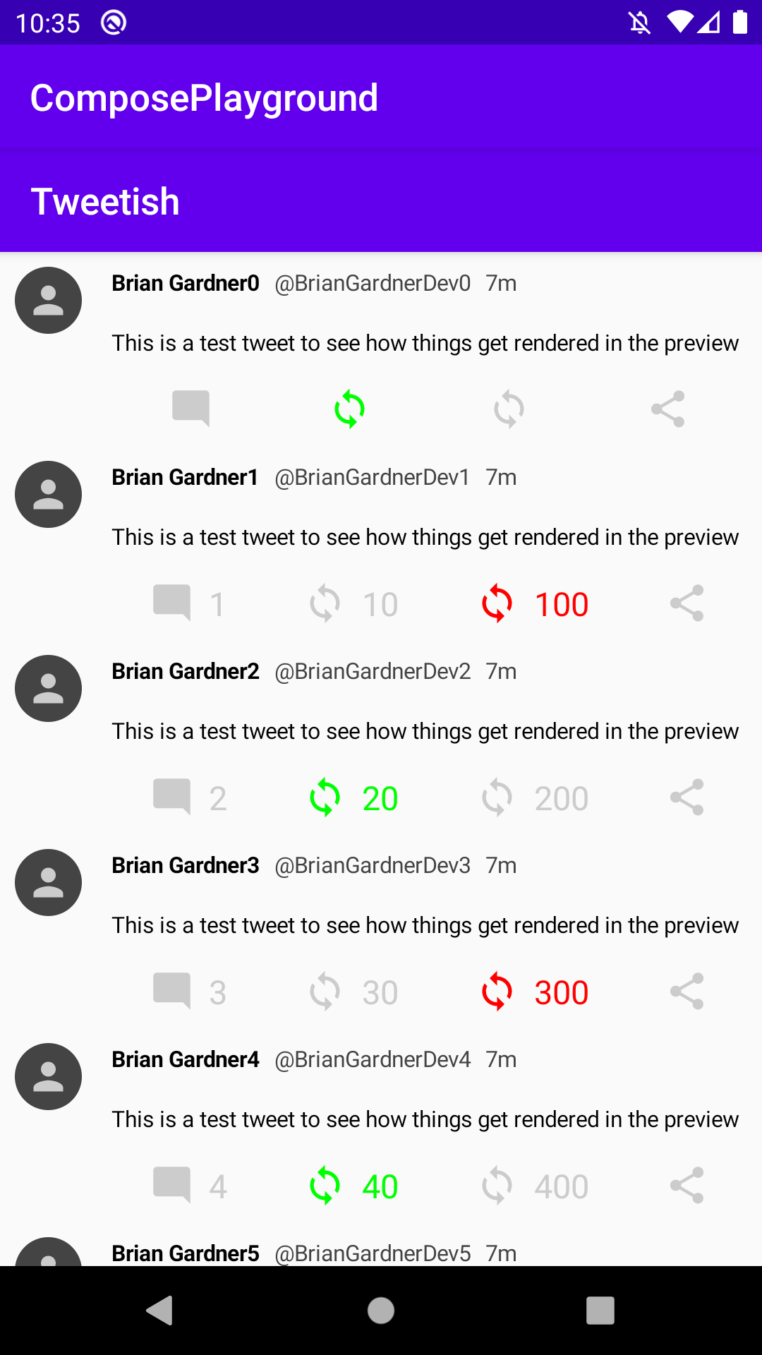
Double trouble
Running the app shows an interesting behavior. There are two app bars displayed. It turns out that my MainActivity is using the default app theme which automatically applies a dark app bar. Updating the AppTheme removes this duplicate app bar.
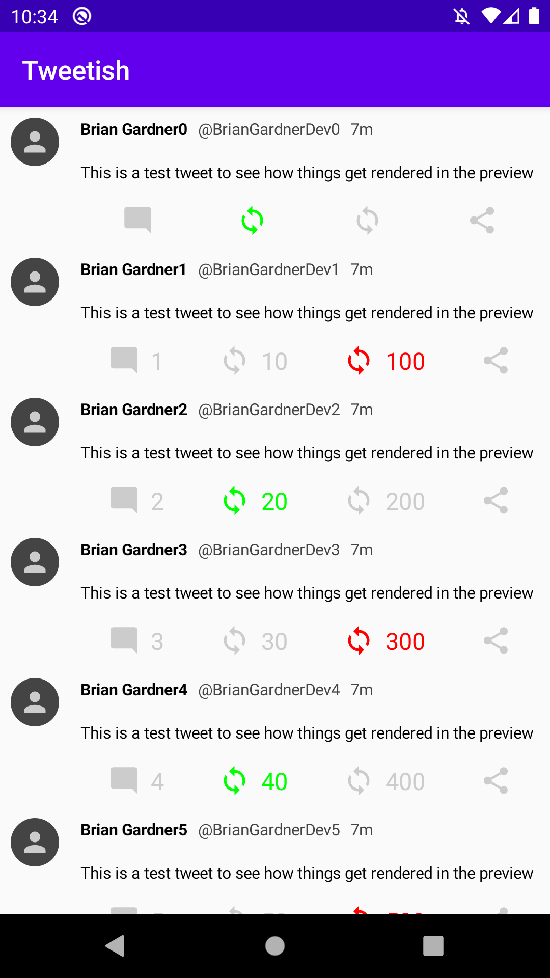
Navigation icon
App bars are often used for navigation purposes. The most common is displaying a hamburger icon indicating there is a navigation drawer off screen.
Adding this requires a drawable resource. Using the Vector Asset Studio, I add the dehaze asset and name it ic_nav_drawer.
To add the icon to the TopAppBar, the navigationIcon parameter is used. This accepts a composable lambda to configure the icon. In this case, I use the IconButton component that wraps an Icon. I am not handling the click event yet (covered in a future post), so I pass in an empty lambda for the onClick parameter of the IconButton.
Running the app shows the new navigation icon in the app bar.
Option menu icons
Another common use of the app bar is to provide menu items for controls the user can take on the screen. A logical control for a list screen is an add button. The first step is to create a new drawable resource. Using the Vector Asset Studio again, I selected the add icon and named it ic_add.
To display the option menu item in the TopAppBar there is a parameter called actions. This parameter also accepts a composable lambda where multiple items can be configured. This lambda operates within a RowScope since all of the icons are displayed in a Row.
The IconButton and Icon combo is used here as well to display the add action.
Duplicating the IconButton allows multiple to be displayed in the app bar.
These are displayed as expected.
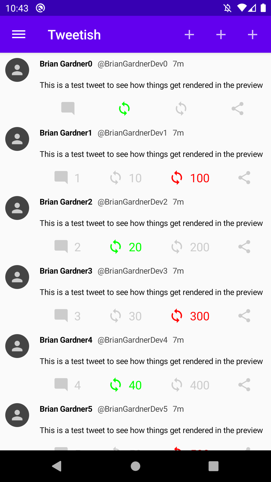
This leads to a question. When there are too many items to display in an app bar, the extra items should go in an overflow menu. What happens if there are many items in the actions lambda?
Running this displays some interesting behavior.
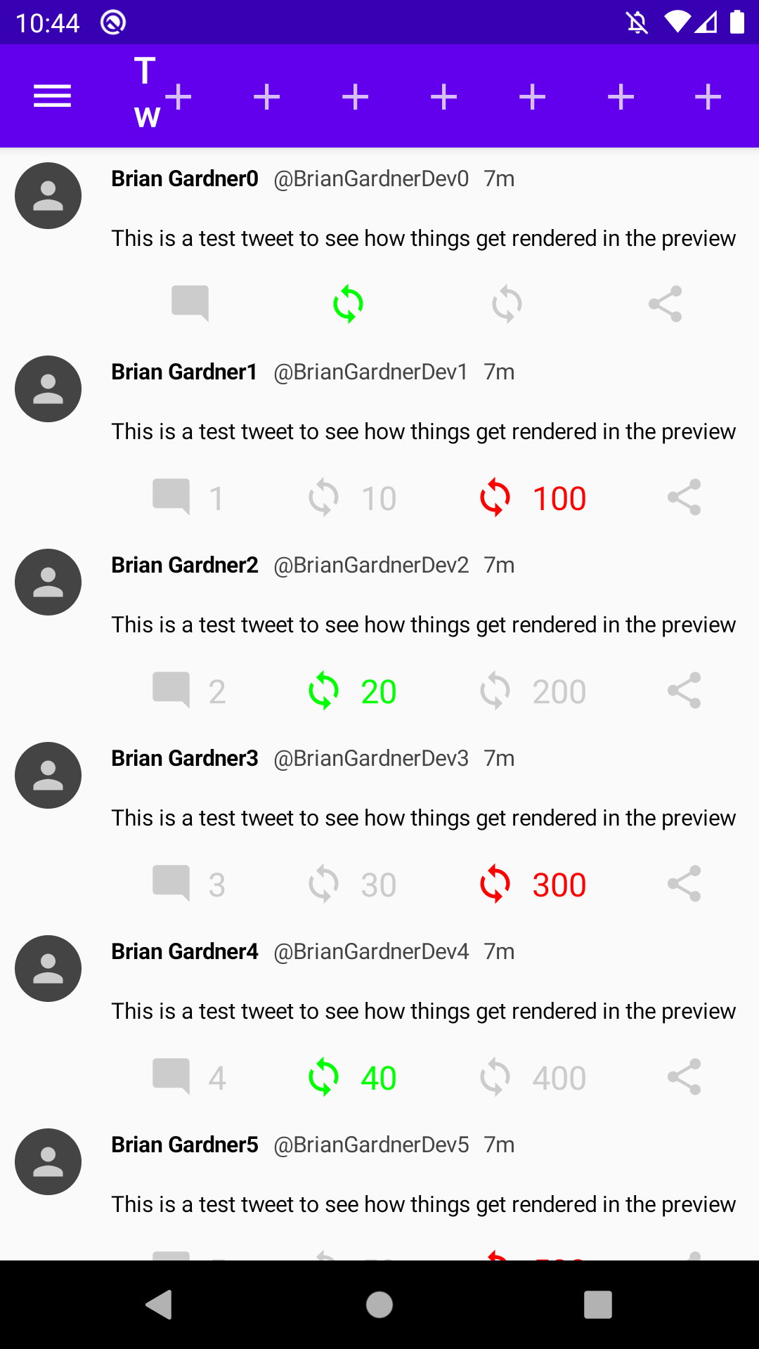
Overflow issues
This is obviously an issue because the action items are not placed in an overflow menu by default. They are pushing the title out of the way and not all of the icons are even displayed in the toolbar (there are 9 actions declared in the previous snippet and only 7 are shown in the screenshot).
Currently there is no mechanism to force an overflow menu with the TopAppBar. This could be manually implemented by adding an overflow action and handling displaying a modal with the additional actions but this is a lot of extra work. The overflow option is coming in a future release so the best option is to limit the number of actions to something small and to test the app to ensure the title in the app bar is not compressed.
This post looked at the TopAppBar component to display an app bar for my Tweetish app. My next post will add a navigation drawer to the app and hook it up to the navigation icon in the app bar. Future posts will look into using the floating action button, bottom navigation, and applying a theme to the app.
Thanks for reading and stay tuned for more!
Photo by Darrell Fraser on Unsplash.