Composable Icon Resources
Published March 06, 2020
(Updated 3/20/2020 with vector drawing changed from dev07 release)
My previous blog post covers setting up an Android project with Jetpack Compose and displaying text. This post focuses on displaying icons for the Tweet’s action row.
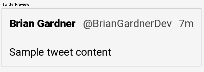
But first, a quick detour. The Tweet content lives between the user information row and the action row. This content is wrapped in a Text element along with an applied TextStyle. Since this composable item is not contained in a Row it also needs padding applied to it directly.
Next up is displaying the content in the preview to verify it looks correct. This is simplified by combining the UserInfoRow and TweetContent composable items in another composable function. The action row will also be added to this new composable function.
Updating the @Preview function displays the current view in the preview pane in Android Studio.
Display the action row
With the Tweet content in place, the action row is the next item to tackle. In my implementation the action row will contain four user actions for a Tweet.
- Comment
- Retweet
- Like
- Share
Each of these actions display an image and react to click events. The Retweet and Like actions also have a selected state to modify their appearance.
Each action requires a separate compose function. Another function combines all of these actions into a row. To get something showing in the preview, Button is used as a placeholder for each action.
Adding the ActionRow into the TweetView displays the action buttons in the preview.
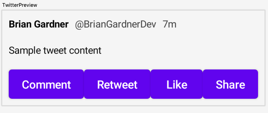
The buttons verify that the action row displays on the screen but it does not match the Tweet view. For this, I need icons. Android Studio provides a tool to create vector assets with the default material icons. To learn how to use it, check out Vector Asset Studio.
I found suitable icons for the comment, retweet, and share actions. I use mode comment for the comment action, loop for the retweet action, and share for the share action. I also set the color for these vector assets to white. White assets are easier to tint the correct color.
Surprisingly, I could not find a heart icon to use for the like action. A quick search on StackOverflow returned this page. The first answer has a vector path that is perfect for my use case (thanks Uddhav Gautam!). My only modification sets the fillColor to white.
The action functions need to load and display these vector assets. Each function can load its icon using the vectorResource() function. The Button components can be removed since they are no longer needed.
When the images are loaded, the action items need a place to draw their icon. There is currently no composable item like ImageButton but the icons can be drawn manually. There is a Container() function that can be used to hold the vector image. Doing so requires using the drawVector() modifier function.
It is tempting to refactor this code to a base function since they only differ in their resource IDs. This would prove painful later on since some of the buttons have different behavior than others. Having a little patience ensures I do not end up with the wrong abstraction.
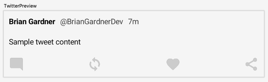
Once each action item has a container with a vector asset, the preview updates to show the action row.
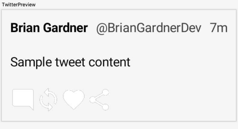
Tint the icons
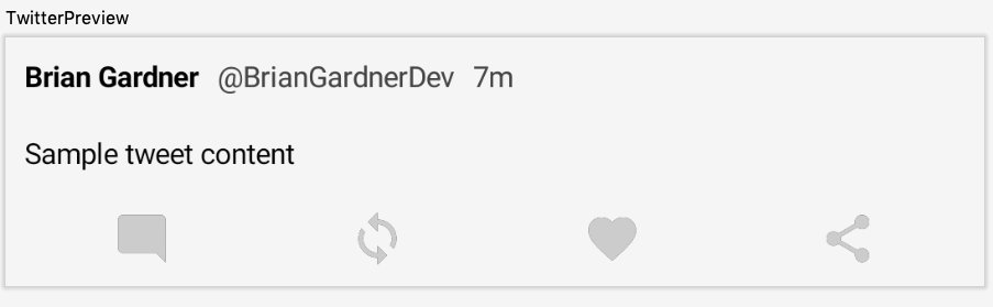
These icons work but they are difficult, if not impossible, to see on a light background. The tintColor attribute on the drawVector() function provides an easy way to specify the color of the icon.
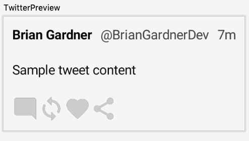
Space out the action row items
The action row has a similar problem to the original user info row. All of the icons are pushed to the left with no padding between them. Instead of manually adding spacing between the icons, I want my icons to be evenly spaced out.
The Row needs two attributes to add space. First, it needs the LayoutWidth.Fill modifier to take up the full width of the view. This leads to a question. The action row already has the LayoutPadding modifier, so how can another one be added?
The solution is found by looking in the Modifier.kt file. In the comment at the top of the file is this line:
 * Modifier elements may be combined using `+` Order is significant; modifier elements to the left
 * are applied before modifier elements to the right.
Multiple modifiers can be combined using the + operator. Adding in the LayoutWidth.Fill modifier forces the row to take up the full width.
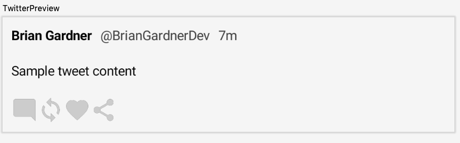
Once the row is appropriately sized, providing an Arrangement parameter tells the row how to position the child elements. The default is Arrangement.Begin which places all of the items at the start of the row with no padding. Other options that do not add padding are Arrangement.Center and Arrangement.End.
Center Arrangement
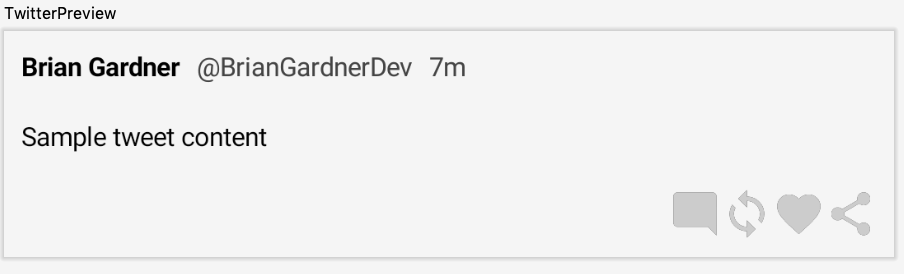
End Arrangement
There are three other arrangement options that provide spacing between the items: SpaceEvenly, SpaceBetween, and SpaceAround.
The code comments in Flex.kt describe what each of these do.
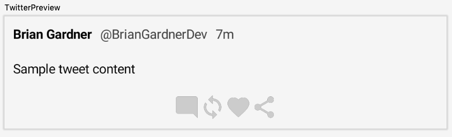
SpaceEvenly Arrangement
Place children such that they are spaced evenly across the main axis, including free space before the first child and after the last child.
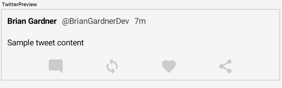
SpaceBetween Arrangement
Place children such that they are spaced evenly across the main axis, without free space before the first child or after the last child.
SpaceAround Arrangement
Place children such that they are spaced evenly across the main axis, including free space before the first child and after the last child, but half the amount of space existing otherwise between two consecutive children.
My preference here is for the SpaceAround version. The row looks better with space before the comment icon and after the share icon, but not the full amount of space that SpaceEvenly uses.
In this post I added the Tweet content and action row to the Tweet view, as well as how to load and draw vector resources, and the different arrangement options for a row. Stay tuned for the next post in the series about handling click events!
Photo by Andrik Langfield on Unsplash