Becoming a Composer
Published February 27, 2020
(Updated 3/20/2020 with vector drawing changed from dev07 release)
Jetpack Compose is a new library from the Android team that simplifies UI creation. Small, composable functions create the building blocks of your view. Combining these building blocks form higher-level views and your full UI.
This blog series focuses on Jetpack Compose by recreating some well known views from popular applications. My first copy-cat attempt is a Tweet view. This example provides room to explore composable functions and manage state.
Tweet view parts
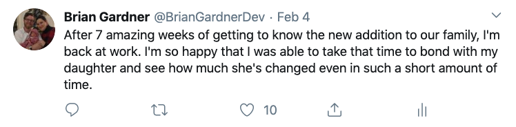
The view for a single tweet is small but it holds a lot of data.
-
User information
- Profile photo
- Display Name
- Twitter handle
-
Tweet information
- Content
- Time since posting
-
Actions
- Comment
- Retweet
- Like
- Share
For a composable app, separate functions represent each of these components. These functions should be small. Their only responsibility providing a component to display their arguments.
Once these individual components are in place, they are combined together to create the full view. Each post in this series will look at a different part of the Tweet view. This first post focuses on setting up a project with Compose and displaying the user’s display name, Twitter handle, and Tweet time.
Project setup
The first step to use Compose is downloading the right version of Android Studio. Version 4.1 of Android Studio is required but at this time only the canary version includes Compose. The 4.0 beta version does not work with compose at this time so make sure to use canary. Find canary versions at the Android Studio archive page.
The only difference when creating a new project is the starter activity. The ‘Empty Compose Activity’ provides the basic template for a composable activity.
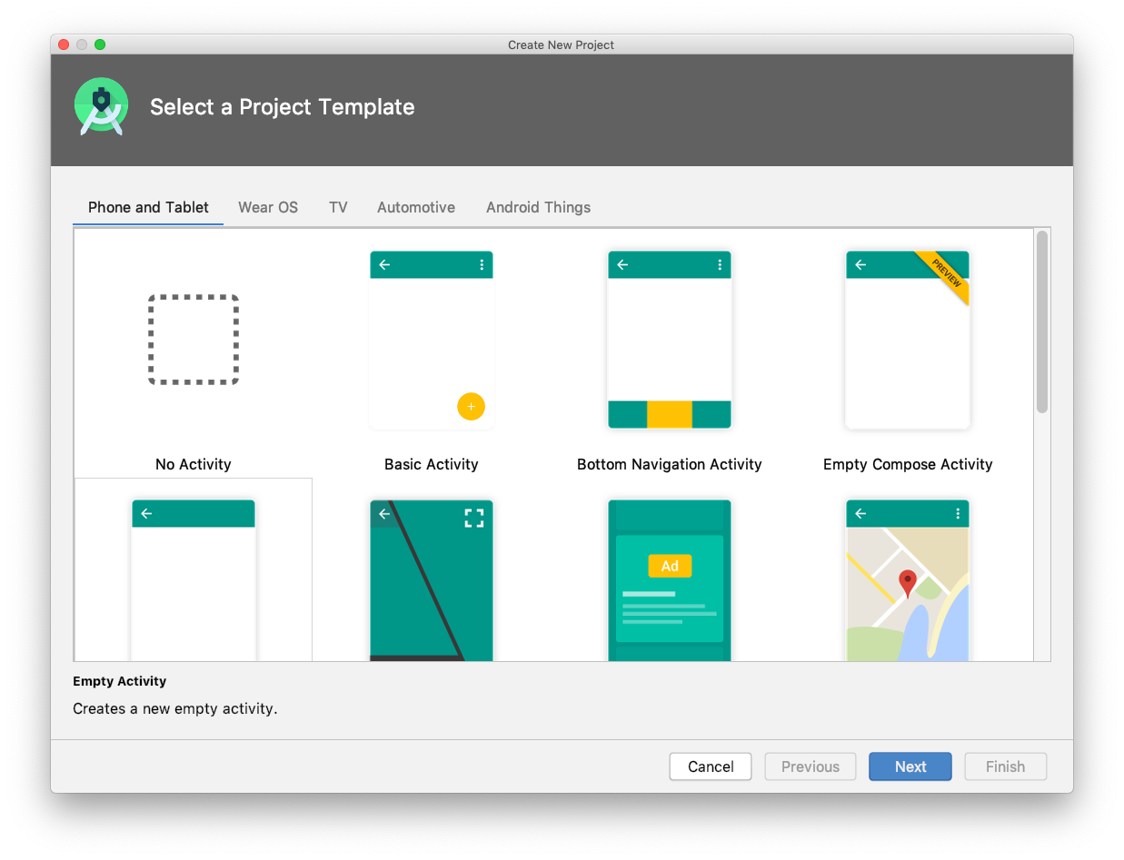
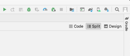
The min SDK version must be at least 21 before creating the project. Once the project is ready, building the app populates the preview pane. If the preview pane is not open, clicking on the split button in the top-right of the screen opens it on the right.
Version updates
At the time of this writing, the version of the Jetpack Compose library provided in the template project is behind the latest version. I did not run into issues with this until trying to deal with vector image loading but updating it now ensures I am using the current APIs.
I update the versions of four compose dependencies to dev07 from dev02.
The compiler requires some additional compose options in the android block. These options specify the Kotlin compiler version and extension versions so everything works with compose.
With these in place I have the right version of compose as well as the right kotlin compiler extensions. For details on the current version of compose, check out the compose release notes.
Finally, deleting the bulk of the default code in MainActivity helps simplify things.
Show some user data
The first composable functions are for the user information at the top of the tweet. These are the user’s display name, Twitter handle, and Tweet time. Displaying text in compose involves creating a composable function whose only responsibility is to display the text. Since there are three text items, I add three functions for each item.
Note that these functions are not defined inside of the MainActivity
class. They should be usable from other classes as well. I just put them in the
same file for convenience.
Each function has the @Compose annotation so the system knows these are
composable functions. Each function has a String parameter for the text to
display.
With these low-level functions in place, I combine them into a higher-level function representing the row of text.
To display items in a row with compose, you use the Row component. This
component accepts a lambda argument with each of the items it needs to
render.
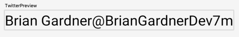
Checking progress in the preview
Building composable functions is quick and I want to be able to verify they look
correct before continuing. Adding the views to my MainActivity view is one
option but then I have to wait for the project to build and deploy each time I
want to change something. A better alternative is the @Preview annotation.
Applying this annotation to a composable function renders its content in
the preview pane in Android Studio. I use this to create a preview function to
view the progress of my tweet view. For now, it displays my current
UserInfoRow.
The MaterialTheme allows me to apply a theme to my composable functions but I
am not using it right now. In a later blog post I will take a look at
what the theme does and how to modify it.
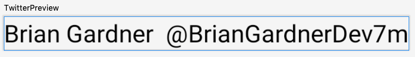
While the row displays all of the text, it still looks pretty bad.
All of the text is the same size and there is no space between any of the
items. By default, the Row takes up as much space as all of the child
items and leaves no extra space for padding.
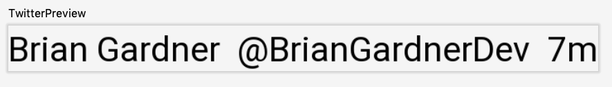
Adding some space
Fortunately, adding space to the text is straightforward. I started by looking
at the DisplayName composable. There is a modifier parameter to
the Text composable where padding can be applied.
The LayoutPadding object has two constructors. The one I use above specifies
the padding for the left, top, right, and bottom of the view separately.
I only pass in a value for the right padding so I can add space
between the DisplayName and the Handle. The other constructor accepts a
single parameter and applies that value to all four areas around the view.
With that padding in place, I copy this padding to the Handle composable to
add space between the twitter handle and post time.
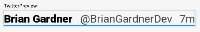
Styling text
Last up for this post is styling the text to look more like the Tweet view. The
DisplayName should be bold with a black color to draw attention while the Handle and
PostTime should be a regular font style and a gray color. All of the text should also be
smaller. I’ll start with the DisplayName.
To modify the style of Text there is a style parameter that accepts
a TextStyle object. The options on this class allow full control of how the
text is displayed.
For the DisplayText I need three of the attributes. I pass in a color,
font size, and font weight. This implementation makes clear that the
Android team put a lot of effort into making a clear API that is easy to
understand.
A similar TextStyle applied to the Handle and PostTime functions makes the
text look right.
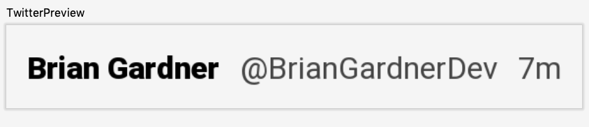
Once the text styles are in place and the preview refreshes, things look much better.
To complete the style, modifying the row with its own padding ensures the text has space between it and the other tweet content.
In this post I setup a project using Jetpack Compose and displayed some text, as well as styled the text and added padding. The next few blog posts will focus on displaying images, handling click events, and dealing with state in Compose. Stay tuned for more!
For more information there is a great tutorial and code lab from Google that I recommend checking out!
Header photo by Jonathan J. Castellon on Unsplash